Case Study Details
Client Y, a leading pharmaceutical company, faced significant challenges with their website’s user experience. The Homepage and Request Samples page were particularly problematic, impacting user engagement and conversion rates.
Key Issues
- User Experience
Key Technologies
- Adobe Target
Key Services
- Conversion Rate Optimization
- Strategy
- Data
Brief Summary
Project 3 Consulting helped a major pharmaceutical company, referred to as Client Y, optimize their Homepage and Request Samples page to improve user experience and increase login and registration conversions. Our CRO expert provided guidance and implemented strategic changes, resulting in significant improvements. Future tests are planned to further enhance the other web pages based on these initial learnings.
The Challenges to Better Conversion Rates
Client Y’s website had several issues:
- The Homepage and Request Samples page were not optimized, leading to poor user experience.
- Buttons and flow were out of place, with no clear goals established.
- The informational flow was disorganized, making it difficult for users to navigate.
- The information architecture was disorganized, further complicating the user journey.
- These issues decimated conversions, impacting overall performance.

“Working with Project 3 Consulting has been a game-changer for our website. Their deep understanding of CRO and user experience has significantly boosted our conversions. We’re excited to continue our collaboration and implement future recommendations on our other web pages for even greater results.”
– Client Y Representative
Our Strategy and Implementation Process
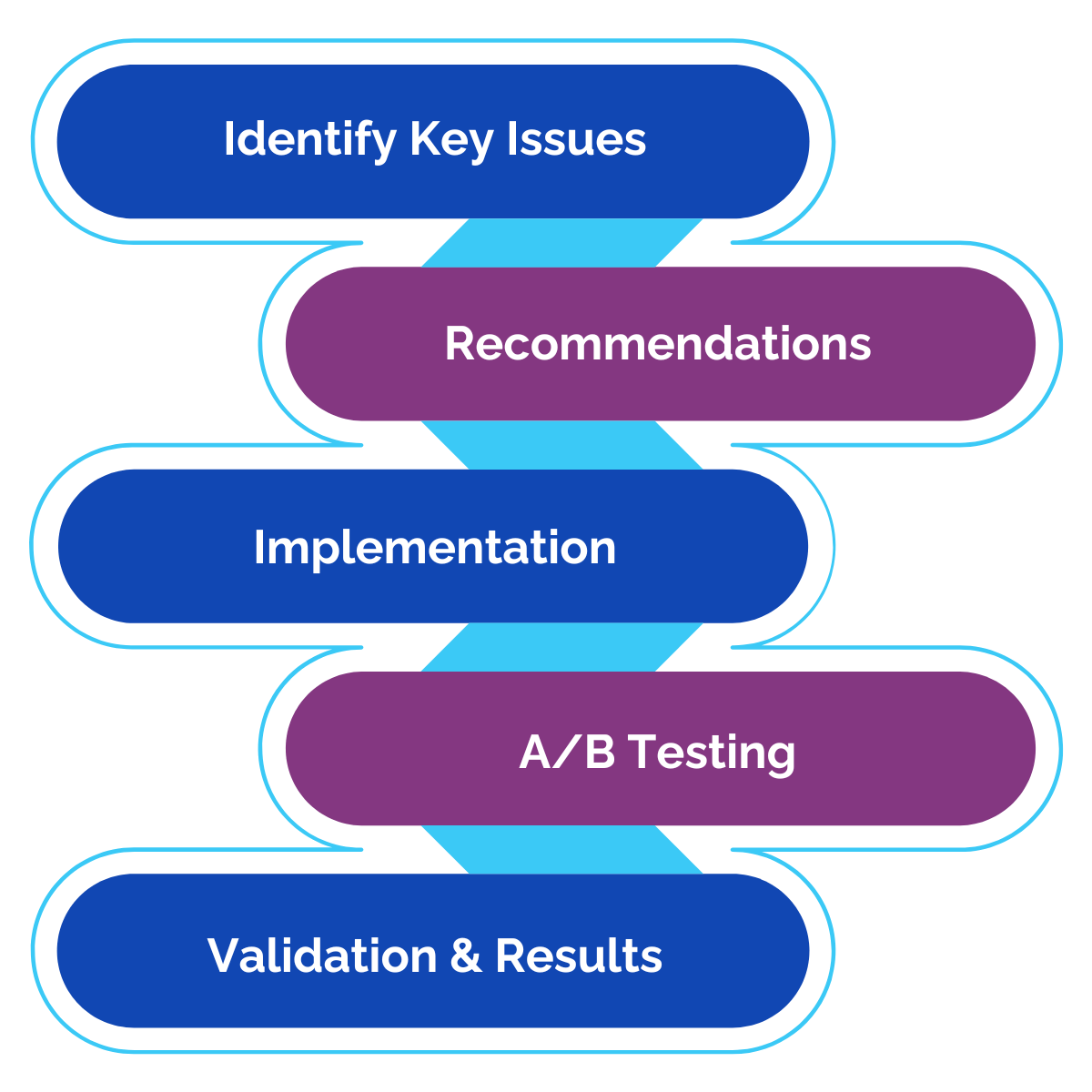
Project 3 Consulting stepped in to address these issues by:
- Leveraging our CRO expert to provide strategic guidance and implement changes.
- Conducting a thorough analysis of the Homepage and Request Samples page.
- Utilizing Adobe Target to assist in the CRO process.
- Reorganizing the content flow to enhance usability.
- Moving critical content blocks, like Register and Sign In, to more prominent positions above the fold.
- Streamlining the 3-step section to create a more intuitive user journey.
- Providing advisory on improving the overall information architecture, scheduled for future implementation.
The Results and Benefits
The impact of our solution was significant:
- Enhanced User Experience: Improved the user experience on the Homepage and Request Samples page.
- Increased Conversions: Logins from the Homepage increased by 19%, and logins from the Request Samples page increased by 50%.
- Improved Engagement: Registrations from the Request Samples page went up by 11%.
- Reduced Bounce Rate: The bounce rate improved to 30% from 37% prior.
- Valuable Insights: Gained insights from initial tests to inform future optimizations.
By partnering with Project 3 Consulting, Client Y overcame critical user experience challenges and now enjoys a more optimized and user-friendly website. Our ongoing support ensures that future tests and improvements will continue to drive positive results.

